This doesn’t involve scripting or programming. I hesitated to include this post because it may come off as a promotion for the new version of MadCap Flare. But this series is about revisualizing TOCs and what better way to do that than to use out-of-the-box improvements?
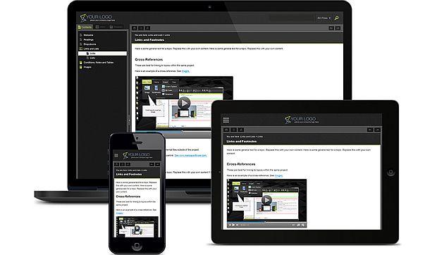
The latest version of MadCap Flare includes an updated HTML5 target type that is more responsive than the previous versions. It adapts more readily for viewing on smart phones, tablets, desktop monitors.
MadCap did not compensate me for this post and I have not yet received a copy of version 10 for the purposes of this blog. However, here is a marketing image provided by MadCap that shows the more responsive output.
Notice the behavior of hiding the TOC on smaller devices and the emphasis on the previous and next buttons in the example skin. Have you tried it yet? What do you think? Let me know in the comments.
So far in this series we have explored revisualizing TOCs with jQuery UI draggable, arbor.js, and an upgrade to version 10 of Flare. I think there are plenty of interesting JavaScript libraries to aid in revisualization. That will probably be the focus of the upcoming posts in this series. But if you have other thoughts about ways to revisualize TOCs, especially in online outputs, let me know in the comments.
